Two-Tone Cabinets: The Undertone Rule Nobody Explains
The first time I repainted my lower cabinets, I picked a cool blue-gray that I genuinely liked on its own, against upper cabinets that were already a warm, slightly yellow cream. I stood back once it dried and something was wrong. Not badly wrong. Just a low hum of "off" that I could not immediately explain, the kind of thing that makes you walk past a room several times trying to work out what's bothering you.
It took me an embarrassing amount of time to realize the two colors were not actually disagreeing on hue. They were disagreeing on temperature. One leaned cool, one leaned warm, and no amount of them being individually nice colors could fix that mismatch.
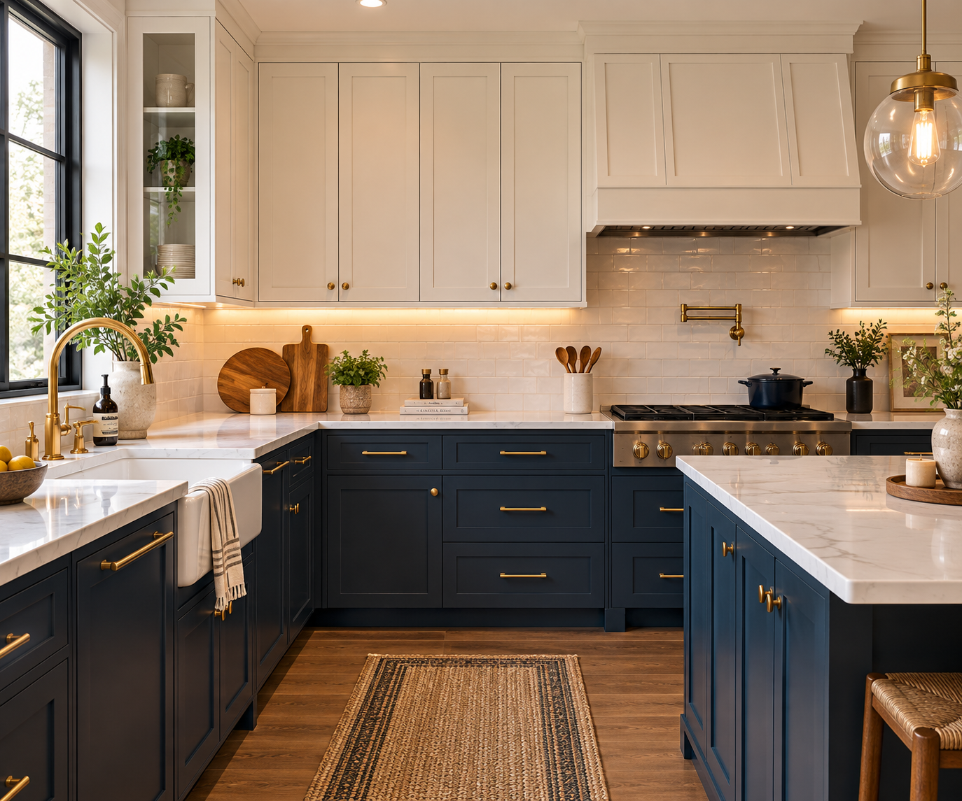
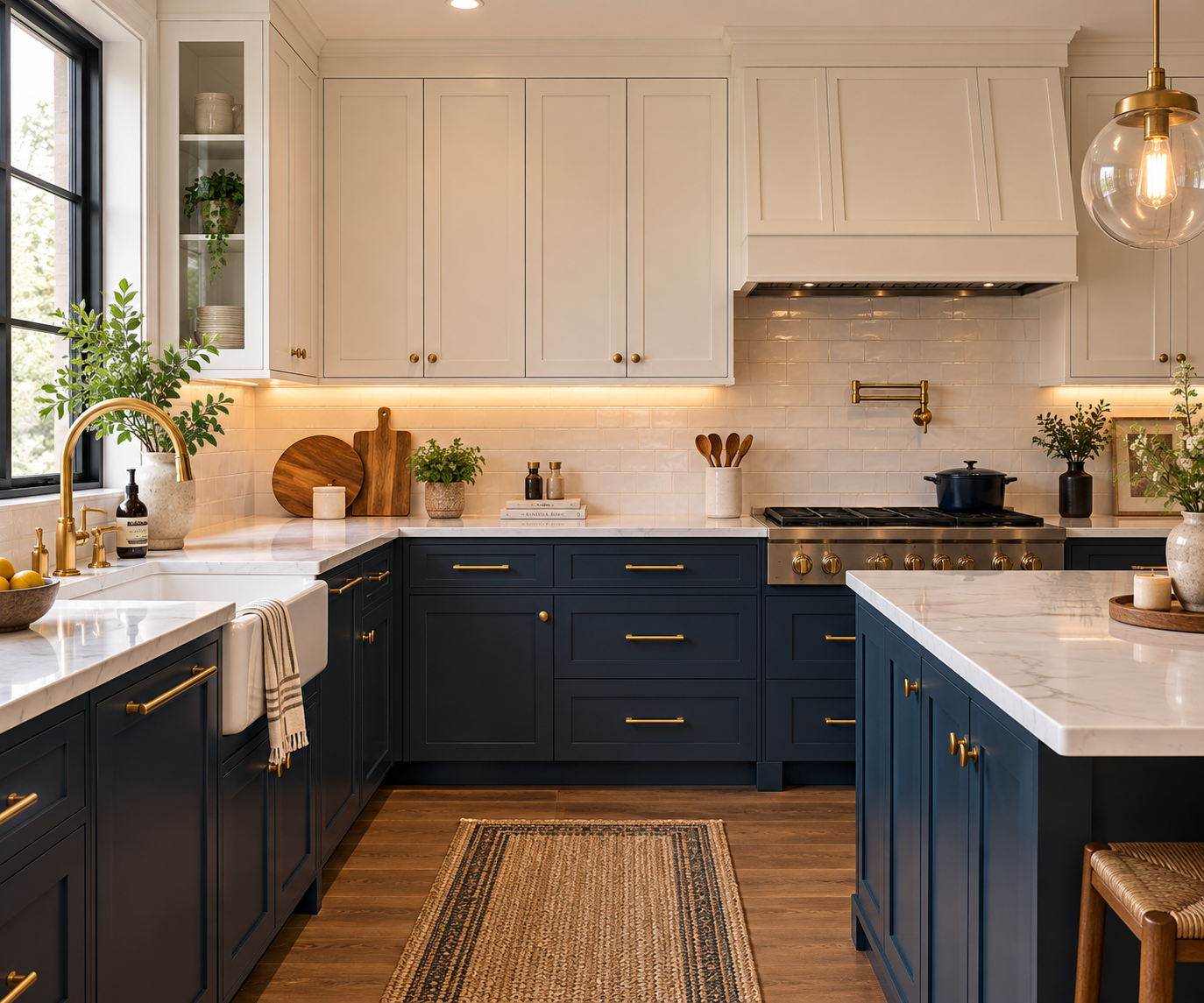
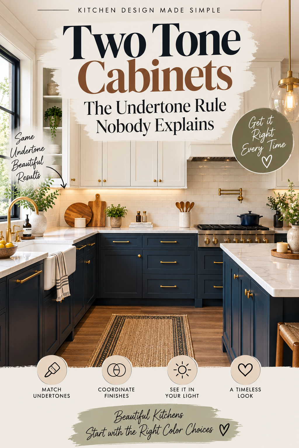
I repainted a second time, a proper navy against a warm white, and the entire kitchen suddenly read as one considered decision instead of two separate ones that happened to share a room.
The rule that actually matters
Match undertone before you match anything else. Warm with warm, cool with cool. This single rule prevents the vast majority of two-tone kitchens that feel slightly wrong for reasons nobody can quite name.
Every color, including whites and grays, leans warm or cool once you look closely. A white can lean yellow or pink (warm) or blue or green (cool). A gray can lean beige (warm) or blue-slate (cool). Two colors can be objectively beautiful individually and still clash the moment they sit next to each other, if one is warm and one is cool.
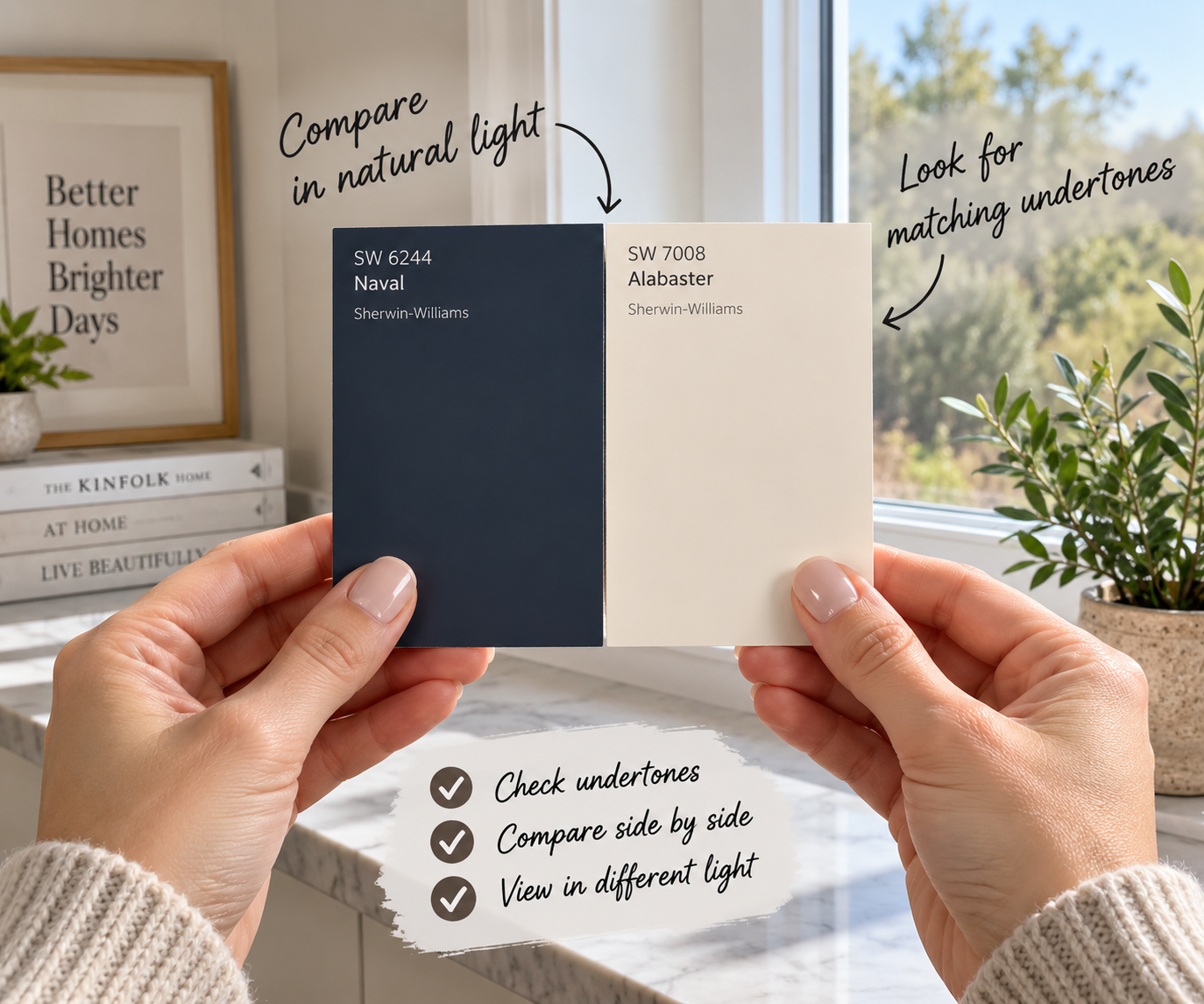
How to actually check this, rather than guessing: hold a paint chip of your intended second color directly against the existing one in daylight, not under a kitchen's overhead bulbs. Undertones hide under warm artificial light and reveal themselves clearly in natural light, which is exactly why so many two-tone kitchens look fine in the store and wrong at home.
The ratio that keeps it from looking accidental
Beyond undertone, the second most common failure is an even split. Fifty-fifty between the two colors tends to read as static, almost like the kitchen ran out of one paint color partway through.
A roughly 60/40 split, with the lighter color taking the larger share, keeps the room feeling open while still giving the darker tone enough presence to register as a real decision rather than an accent that got forgotten. This is the same repetition-over-matching principle that applies to any room → Does Furniture Have to Match?: one color needs to clearly lead, with the second supporting it, rather than the two competing for equal attention.
If you want to test the ratio before committing to paint, sample doors in both colors held against each other, at roughly the proportion you're planning, will tell you more in five minutes than any photo of someone else's kitchen will.
The three pairings that hold up over time
Navy lower, warm white upper. The most searched and most photographed combination for a reason. Navy reads as timeless rather than trend-driven, and it pairs naturally with brass or unlacquered hardware, which adds a third layer of warm contrast without introducing a third color. This is close to the safest starting point if you are unsure.
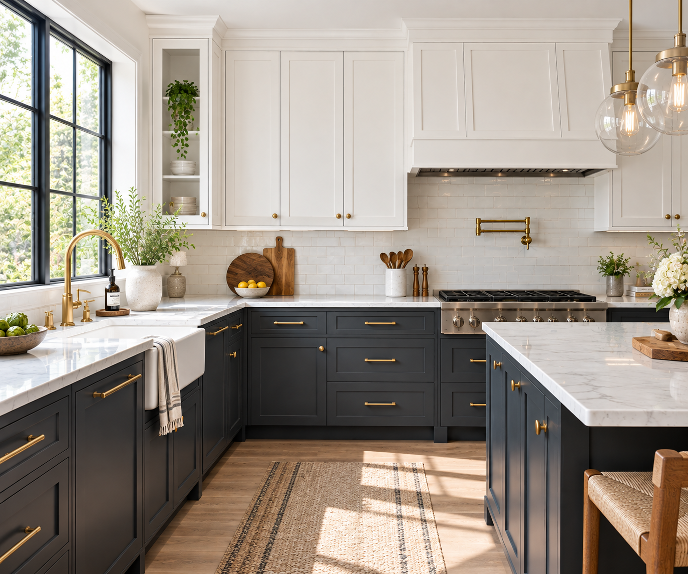
Charcoal or soft black lower, warm white upper. A slightly more dramatic version of the same structure. Works particularly well in kitchens with strong natural light, since the light keeps the dark tone from feeling heavy. In a genuinely dark kitchen, this combination can tip toward gloomy rather than grounded, so it is worth testing in your actual light before committing.
Warm wood lower or island, painted white upper. The gentlest version of two-tone, and often the easiest to live with long-term because natural wood grain forgives small inconsistencies in a way flat paint does not. This pairing also sidesteps the undertone problem almost entirely, since wood grain reads as warm by nature and pairs easily with a warm white.
✅ Why these three keep coming back
- Each one separates upper and lower clearly enough to register as a real decision
- All three photograph and age well, rather than looking dated within a few years
- Each pairs easily with brass, warm wood floors, or both, without needing a third color to hold it together
❌ Where each one can go wrong
- Navy can read almost black in low light. Test at night, not just during the day.
- Charcoal needs genuinely good natural light or the kitchen can feel heavy rather than grounded.
- Wood lower cabinets show wear differently than paint, and need a compatible finish on nearby surfaces to avoid looking mismatched.
Comparing the three
| Navy + warm white | Charcoal + white | Warm wood + white | |
|---|---|---|---|
| Best for | Most kitchens, most light levels | Bright, sunlit kitchens | Traditional or transitional styles |
| Undertone risk | Low, navy is forgiving | Medium, needs strong light | Very low, wood reads warm naturally |
| Hardware pairing | Brass or unlacquered brass | Black or brushed brass | Brass or matte black |
| Ages well | Yes | Yes, in the right light | Yes, especially in older homes |
Testing before you commit
Order actual sample doors or large paint chips in both colors, not just small swatches. Small chips are notoriously unreliable for undertone, since a two-inch square of color behaves differently than a full cabinet door does.
A cabinet paint sample set built specifically for testing pairs before a full repaint takes the guesswork out of this step, and it is far cheaper than repainting twice, which is a sentence I can say with some authority.
Once a pairing is chosen, a quart of warm white cabinet paint for the uppers and a quart of navy cabinet paint for the lowers is enough to test the full combination on the actual cabinets, in the actual room, before buying the larger quantities needed to finish the job.
Hardware is not an afterthought here
A single consistent hardware finish across both cabinet colors ties the two tones together the same way one repeated accent color pulls together an otherwise neutral wardrobe. The same three-times repetition principle that makes an accent color read as a decision → How to Add One Strong Color to a Neutral Wardrobe applies to hardware across a two-tone kitchen. One finish, used consistently on both the upper and lower cabinets, reads as intentional. Mixed finishes without a clear pattern reads as unplanned.
Unlacquered brass hardware is the most common pairing across all three combinations above, largely because it develops a soft patina over time rather than staying showroom-shiny, which tends to suit a two-tone kitchen's slightly collected, considered feel better than a hard, bright finish does.
What to avoid
Mismatched undertones, always the first thing to check. A cool gray against a warm cream will read as slightly wrong no matter how nice each color is individually. This was my entire first failed attempt.
A perfectly even split. Roughly 60/40 reads as a decision. Fifty-fifty reads as running out of paint partway through.
A third or fourth color competing for attention. The same rule that governs any small kitchen's color and material choices → Small Kitchen Ideas That Actually Work applies here directly. Let the two cabinet tones be the stars, and keep walls, backsplash and countertop quiet enough to support them rather than adding a third loud decision to the room.
Skipping the daylight test. Kitchen lighting is often warm and artificial, which can hide an undertone clash until the sun comes up the next morning and the mismatch becomes obvious.
The short version
Two-tone cabinets fail for one reason far more often than any other: mismatched undertones. Match warm with warm and cool with cool before worrying about the specific hue. Aim for roughly 60/40 rather than an even split. Keep hardware consistent across both tones. Test everything in real daylight before committing to a full repaint.
My second attempt cost the same as the first. The only thing that changed was checking the undertone before opening the can.
Affiliate Disclosure
Some links in this post are affiliate links. If you buy something through one, GlamNestStudio may earn a small commission at no extra cost to you. I only link to things I would recommend to a friend, and I have used or genuinely researched everything mentioned here.
Before you go
More on making a small kitchen feel considered rather than accidental, across the guides on GlamNestStudio.