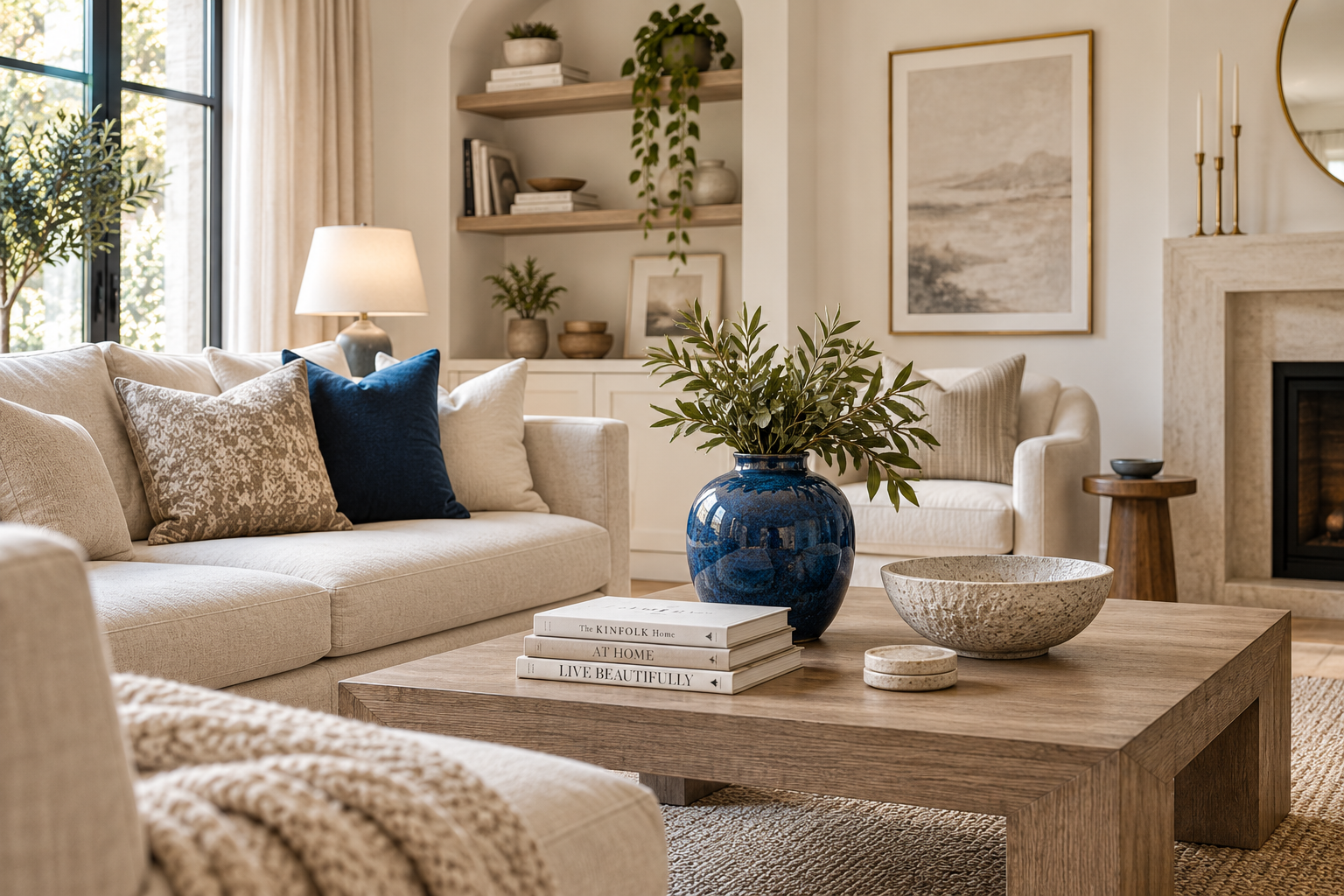
How to Add Color to an All-Neutral Room (Without Repainting Everything)
Disclosure: this post contains affiliate links. If you buy something through one, I may earn a small commission at no extra cost to you.
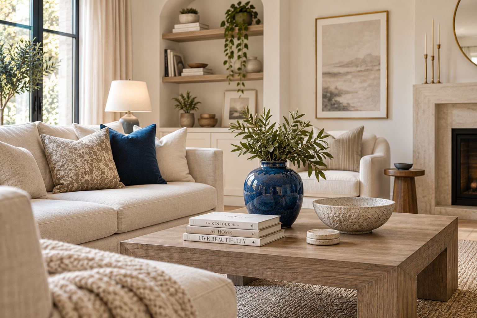
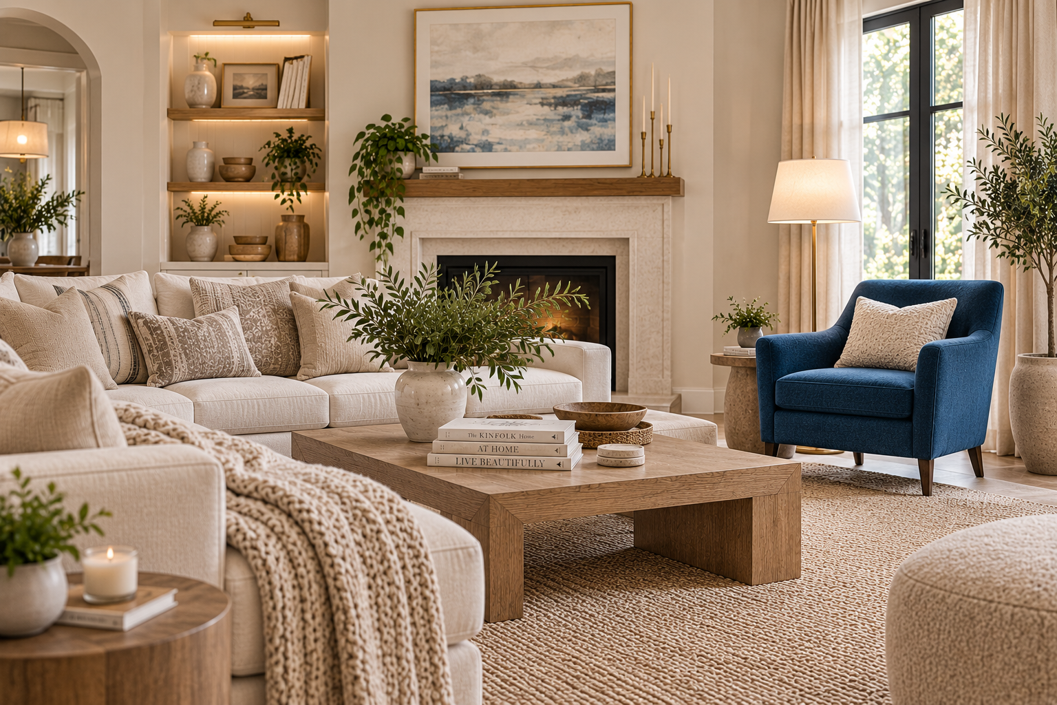
I lived in an all-white rental for two years and told people it was "calm." It was calm. It was also a little like living inside a hotel lobby, and I didn't add a single strong color to it until a friend's living room warm, a little cluttered in the good way, with one deep blue armchair anchoring the whole thing made me realize calm and empty aren't actually the same word.
The all-neutral approach had felt safe because it was reversible and it went with everything. Which is true, and also exactly why it never committed to anything. A room with no color in it isn't calm so much as unfinished the same unfinished feeling that comes from having no focal point at all → Living Room Focal Point: Why Your Room Feels Unfinished.
Interior design coverage this year backs up what that one blue armchair taught me: the all-neutral moment is giving way to warmer, more personal, more textured rooms. Here's how to move in that direction without repainting a single wall.
Why all-neutral rooms feel unfinished
A room with no color contrast asks nothing of your eye. Nothing pulls focus, nothing feels chosen, and this is the part people don't expect nothing looks particularly expensive either, despite how much is often spent chasing "elevated neutral" pieces.
Color is one of the strongest tools a room has for feeling intentional. A neutral room isn't wrong, but a neutral room with zero color decisions in it reads as undecided rather than restrained, and there's a real difference between the two.
The fix isn't repainting. It's adding one accent color, deliberately, in a small number of places the same repetition principle that runs through almost everything in this house → Does Furniture Have to Match?, just applied to color instead of furniture.
Start with one color, not a palette
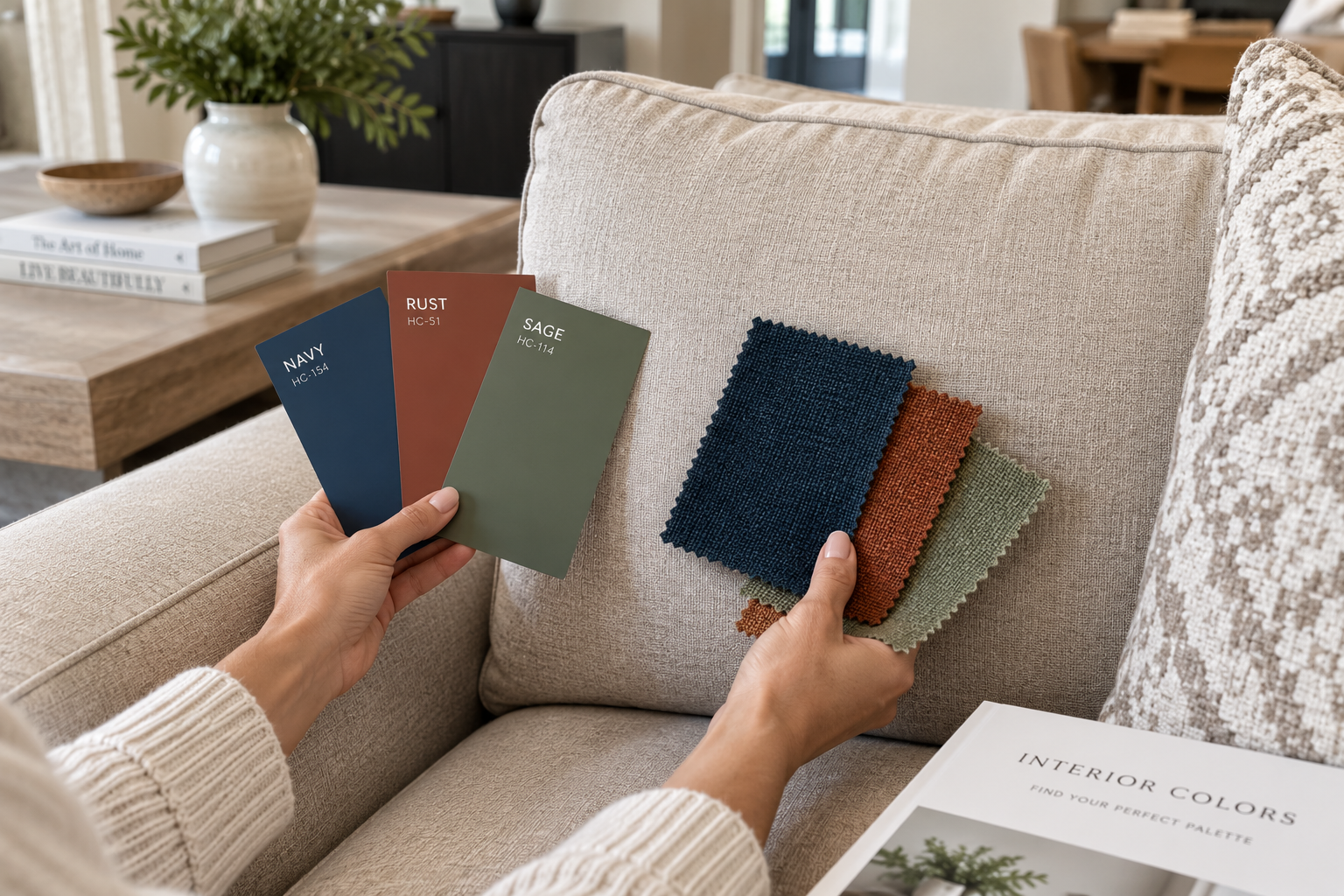
Pick a single accent color before buying anything. Not a scheme, not three complementary tones one color you're pleased to look at.
This year, that color is very often blue a cool, slightly icy blue is the standout accent across both fashion and interiors right now, showing up in ceramics, textiles, tile and glassware far more than as wall paint. It's worth knowing about specifically because it's an unusually easy color to introduce in small doses without the room reading as "trendy" it reads as considered.
But the method matters more than the specific color. Rust, forest green, deep plum any of these work exactly the same way blue does here. Pick the one you'd be glad to see three times a day, not the one currently trending, and use this post as the technique regardless of which color you land on.
The three-times rule
An accent color needs to appear at least three times across a room before it reads as a decision rather than a coincidence. This is the exact threshold that makes repeated wood tones or metals look intentional in mismatched furniture, and it works identically for color.
Once is an accident. A single blue cushion on an otherwise all-beige sofa looks like it wandered in from another room.
Twice is close, but still reads as sparse.
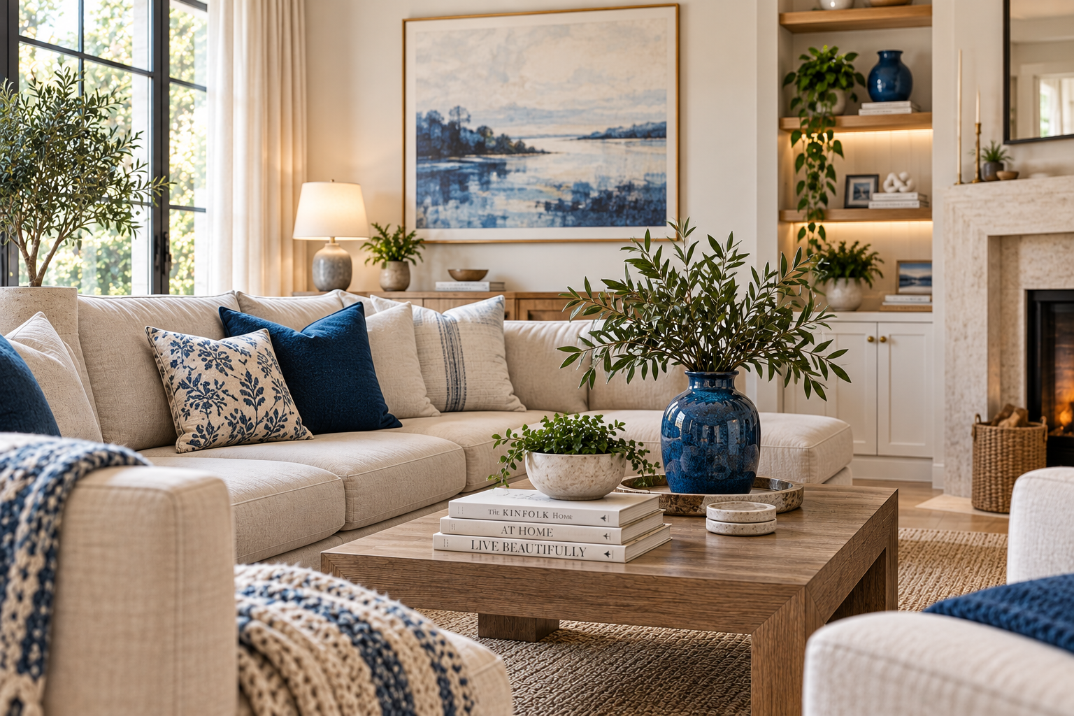
Three times is where it clicks. A cushion, a ceramic object, and something in the art on the wall. Suddenly the color feels chosen rather than stray.
The easiest way to hit three without much cost:
- One ceramic vase or bowl in the accent color, placed somewhere visible
- One or two cushion covers cheaper and easier to change than the cushions themselves → 10 Common Home Decor Problems
- One piece of art or a print that includes the color, even as a minor element rather than the dominant one
Where color works without commitment
Textiles first. Cushions, throws, a runner. Cheapest, fastest to change again later if you get tired of it, and zero risk.
Ceramics and glassware second. A vase, a set of glasses, a bowl left out on a shelf rather than in a cabinet. Small objects carry color surprisingly well because they're seen against a large neutral backdrop, which makes even a small amount of saturation register clearly.
One piece of furniture, if you're ready to commit further. A single accent chair in a strong color is the classic move for a reason it also gives the room a natural focal point almost automatically, since it's the one saturated object in an otherwise quiet room.
Flowers and plants, genuinely underrated. A deep blue or richly colored ceramic planter does double duty the color of the pot and the natural color of whatever's growing in it.
Paint, last, and only once you're sure. A single accent wall is far less commitment than a full room, but even that's worth waiting on until you know the color works for you in cushions and objects first paint is the hardest and most expensive of these to reverse.
What the "warmer, more personal" shift actually looks like
This isn't a call to abandon neutrals it's an argument for a different balance. The strongest current interiors coverage describes this less as maximalism for its own sake and more as curated maximalism: expressive, but still edited, with texture and personal objects doing as much work as bold color.
What that looks like in practice:
- Warm neutrals as the base not stark white, but cream, oatmeal, warm gray
- One accent color repeated with intention, rather than several colors competing
- Texture doing a lot of the "warmth" work the same texture principle that fixes a cold, flat room applies directly here
- Personal, collected objects mixed in rather than everything bought as a matching set
What to avoid
Adding several accent colors at once. The same failure as three competing focal points in one room multiple accent colors cancel each other out rather than adding up to more personality.
Chasing the exact trending shade instead of a color you actually like. A color you're tired of in a year is worse than a slightly less "current" one you'll still want to look at in five.
Going straight to paint. The most expensive and hardest-to-reverse option on this list, and it should be the last one tried, not the first.
Matching the accent color exactly across every object. Slightly different shades of the same color family a deep blue vase, a lighter blue cushion, a blue-green plant read as more considered than three identical swatches of one exact hex code. This is repetition, not matching, applied to color the same way it applies to wood tones or metals.
Testing it before you commit further
Live with the textiles and objects for a couple of weeks before adding a piece of furniture or paint in the same color. Colors read differently at different times of day, and a photo from the doorway will tell you honestly whether the accent is working or whether it's fighting the rest of the room.
If you're still reaching for that cushion or noticing that vase after a month, the color's earned its place. If it's started blending into the background, it either needs to be repeated once more or it wasn't the right color to begin with.
My own shift started with one ceramic vase in a blue I liked more than I expected to. It's still there. Two cushions and a small print joined it over the following few months, and the room stopped feeling like a hotel lobby somewhere around the second cushion.
The short version
An all-neutral room isn't wrong, but it's rarely finished on its own. Pick one accent color you actually like. Repeat it at least three times, starting with the cheapest and most reversible options textiles and small objects before committing to furniture or paint.
That's most of what separates a "calm" room from one that's just empty.
Affiliate Disclosure
Some links in this post are affiliate links. If you buy something through one, GlamNestStudio may earn a small commission it doesn't cost you anything extra. I only link to things I'd recommend to a friend, and I've used or genuinely researched everything mentioned here. It's what keeps the guides on this site free.
Before you go
More on color, texture and the small changes that make a room feel finished, across the guides on GlamNestStudio.