How to Lay Out a Long, Narrow Living Room
Disclosure: this post contains affiliate links. If you buy something through one, I may earn a small commission at no extra cost to you.
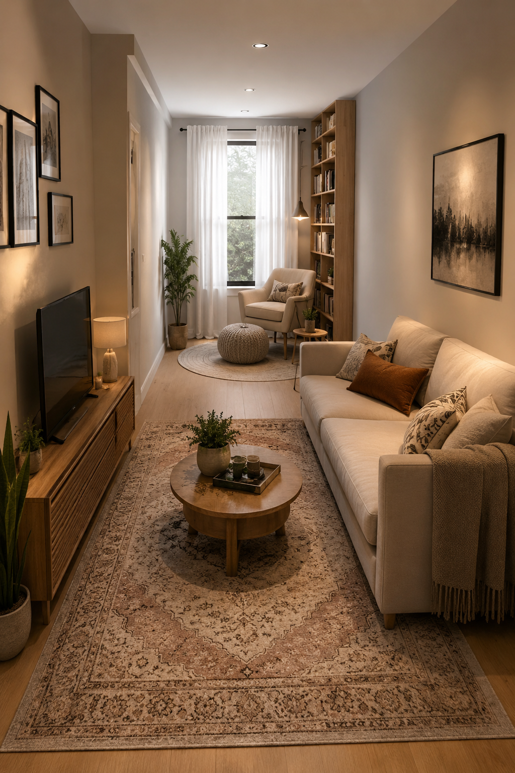
I lived in an apartment where the living room was 22 feet long and 11 feet wide. On paper that's a decent amount of space. In practice it was a bowling alley with a TV at one end.
I did what everyone does: pushed the sofa against one long wall, put a chair against the opposite long wall, and left a corridor down the middle. Which meant the room's most obvious feature its length got emphasized every single time you walked in.
The dimensions weren't the problem. The layout was reinforcing them.
Why narrow rooms feel worse than they measure
A room reads as a hallway when there's one long uninterrupted sightline through it and nothing breaking the length.
Push furniture flat against both long walls and you've created exactly that: two parallel lines pointing at the far end, with a channel between them. Your eye runs straight down it and the room announces its proportions immediately.
Everything below is a variation on one idea interrupt the length. Give the eye something to stop on before it reaches the far wall.
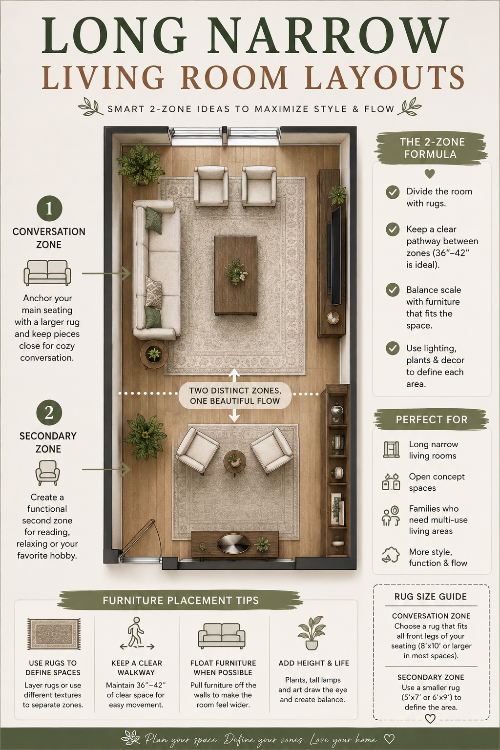
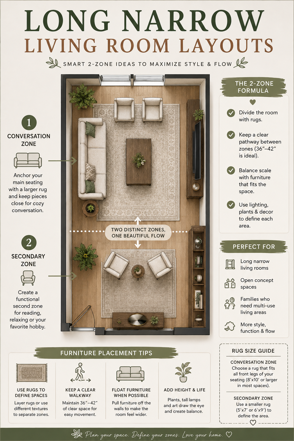
Layout 1: Two zones (the best fix if you have the length)
If the room is 18 feet or longer, stop treating it as one room.
Split it into two purposes. Main seating at one end, something else at the other a reading corner, a desk, a small dining area, a console with plants.
Why it works: two smaller defined areas read as two rooms, not one long one. Nobody looks at a two-zone room and thinks "narrow." They think "this room does two things."
How to divide without building anything:
- Two rugs, one per zone. The most effective and least invasive method.
- A sofa with its back to the second zone, acting as the boundary
- A console table or low bookcase perpendicular to the long wall
- Different lighting in each zone this alone does more than people expec
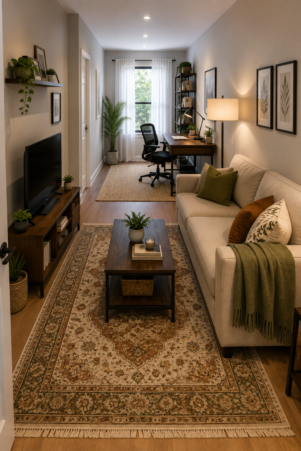
The mistake to avoid: don't make the zones equal. One should clearly be the main event and the other secondary, or the room looks indecisive. Roughly two-thirds / one-third.
Layout 2: Float the seating group
Pull the sofa away from the long wall even 12 to 18 inches and turn the seating inward so the chairs and sofa face each other rather than both facing the far end.
Why it works: a conversation grouping is roughly square. Dropping a square arrangement into a rectangular room breaks the rectangle, and the leftover space at either end reads as breathing room rather than emptiness.
This costs nothing and it's the same principle behind pulling one piece off the wall in any awkward room → How to Arrange a Living Room With One Usable Wall — it's just applied to the whole group instead of one chair.
What you need:
- 30 to 36 inches for a walking path behind or beside the floated group
- 18 inches between sofa and coffee table
- 3 to 8 feet between facing seats closer than 3 feet is intense, further than 8 and conversation dies
If you float the sofa, put a narrow console table behind it. It hides the sofa back, gives you a surface and a lamp position, and makes the floating look intentional rather than unfinished.
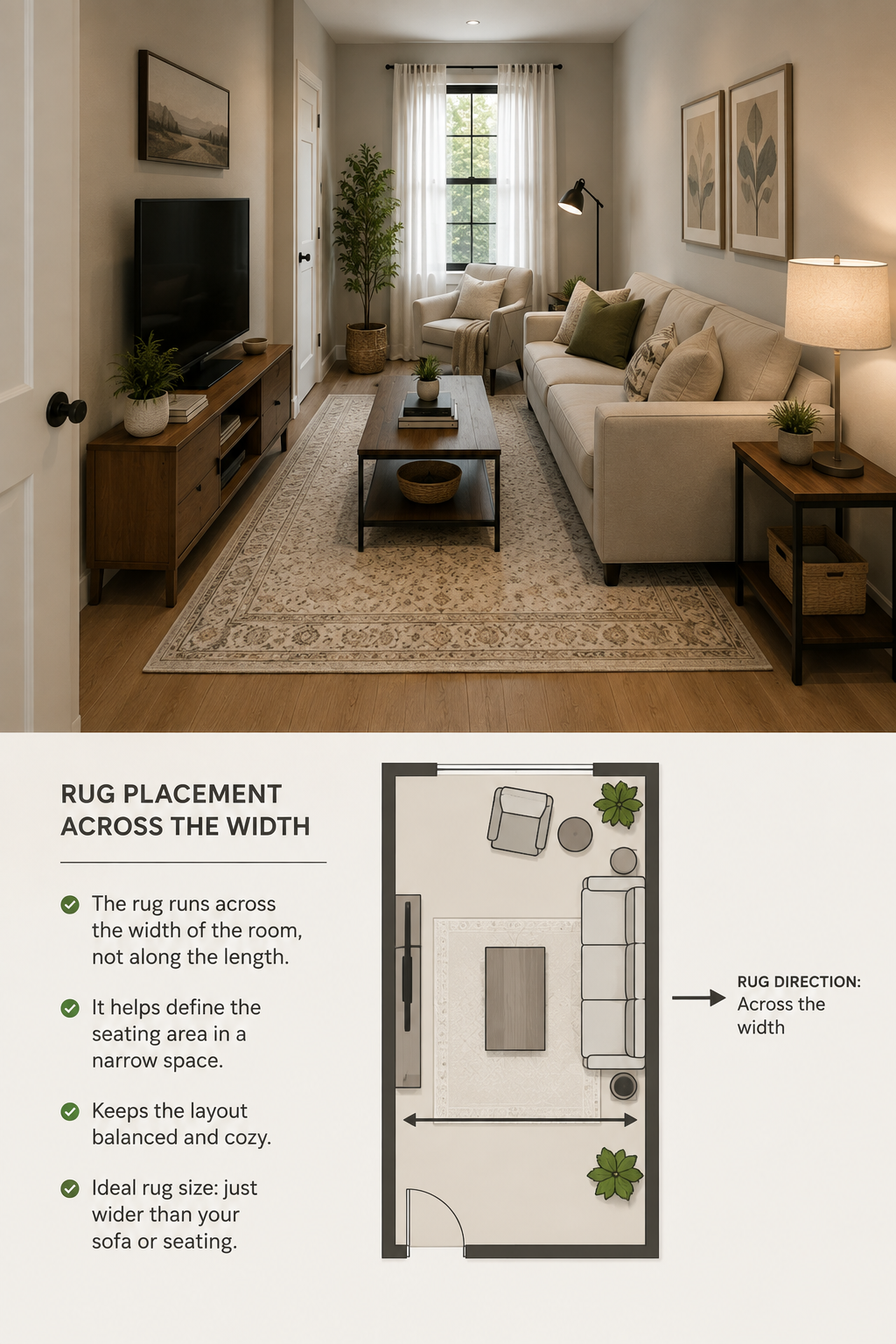
Layout 3: Run everything across the width
Counterintuitive one. Instead of arranging along the length, arrange perpendicular to it.
Sofa against one short wall, facing down the room. Chairs at the far end facing back. The rug runs across the room's width, not with its length.
Why it works: every horizontal line you introduce fights the room's dominant vertical axis. A rug laid crosswise is the strongest version of this it visually widens the floor plane in a way that's surprisingly effective.
When it doesn't work: if the short walls are occupied by a window, a door, or a fireplace, which is often the case. Check first.
Layout 4: One long wall, one broken wall
If you only have one usable wall a very common situation in narrow rooms, since one long wall usually has the door and the window then the sofa goes on the good wall and everything else gets angled.
The key is not lining the opposite wall. Instead:
- One armchair angled at roughly 30 degrees toward the sofa
- A floor lamp arcing over from a corner
- A tall plant or narrow shelf breaking the far wall's flatness
The full method for one-wall rooms is here → How to Arrange a Living Room With One Usable Wall — narrow rooms are the hardest version of that problem.
The things that help regardless of layout
Break the long walls visually
A single unbroken long wall exaggerates length. Interrupt it:
- One large piece of art positioned off-center, not centered on the wall
- A tall bookcase partway down, which stops the eye
- Wall sconces at intervals, which create rhythm
Use the short walls hard
Short walls are your friends because they're perpendicular to the problem. Put your focal point on a short wall if you possibly can → Living Room Focal Point: Why Your Room Feels Unfinished — a big piece of art, a painted accent wall, the TV.
A dark or saturated color on the far short wall pulls it visually closer, which shortens the room. This is one of the genuinely effective color tricks and it costs a gallon of paint.
Curtains across the full width
If there's a window on a short wall, hang the curtains high and wide enough to cover most of that wall → How to Hang Curtains So Your Ceilings Look Taller. A wall of fabric reads as wider than a window with two thin panels.
Light at both ends
A narrow room lit from one end tapers into darkness, which makes it feel longer and more tunnel-like. Put a light source at each end a floor lamp in the far corner is enough.
Pick low, wide furniture
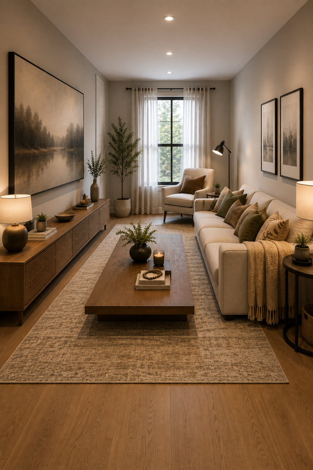
Tall narrow pieces emphasize height and length. Low wide pieces a long low console, a wide low coffee table, a sofa without a high back spread the visual weight sideways.
What to avoid
Lining both long walls. The bowling alley. This is the default everyone falls into and it's the single worst thing you can do in a narrow room.
A long narrow rug down the middle. It mirrors the room's proportions exactly and doubles down on the problem. Either go wide enough to nearly touch the furniture, or run it crosswise.
A row of small pictures along the long wall. Creates a horizontal line that runs the full length and drags the eye all the way down. One large piece beats seven small ones here.
Everything the same height. A flat horizon line makes the length more obvious. Vary it a tall plant, a low table, a floor lamp.
The clearances to protect
Whatever you do, keep these:
- Main walking path: 30–36 inches
- Secondary path: 24 inches minimum
- Sofa to coffee table: 14–18 inches
- Between facing seats: 3–8 feet
- Around a floated sofa: at least 24 inches behind it
A narrow room punishes you for getting these wrong far more than a square room does, because there's no slack anywhere.
Test it before you move anything
Painter's tape on the floor, outlining the arrangement you're considering. Walk the room. Sit where the sofa will be. Look from the doorway.
Then photograph it from the door a photo flattens the room and shows you whether the length still dominates. It's the same test I use for rug sizing → Rug Sizing: The One Guide You Actually Need and pretty much everything else.
In my bowling alley, the change that worked was splitting it into two zones with two rugs and floating the sofa 18 inches off the long wall. Same furniture. Same room. It stopped reading as a corridor the same afternoon.
The short version
The room isn't too narrow. The furniture is agreeing with the narrowness.
Split it into two zones if it's long enough. Float the seating group inward. Run the rug across the width. Put your focal point on a short wall. Light both ends.
Any two of those will change how the room reads. All five and you'll stop noticing the proportions at all.
Affiliate Disclosure
Some links in this post are affiliate links. If you buy something through one, GlamNestStudio may earn a small commission it doesn't cost you anything extra. I only link to things I'd recommend to a friend, and I've used or genuinely researched everything mentioned here. It's what keeps the guides on this site free.
Before you go
More on working around rooms that won't cooperate — one-wall layouts, awkward doorways, dark corners — across the guides on GlamNestStudio.