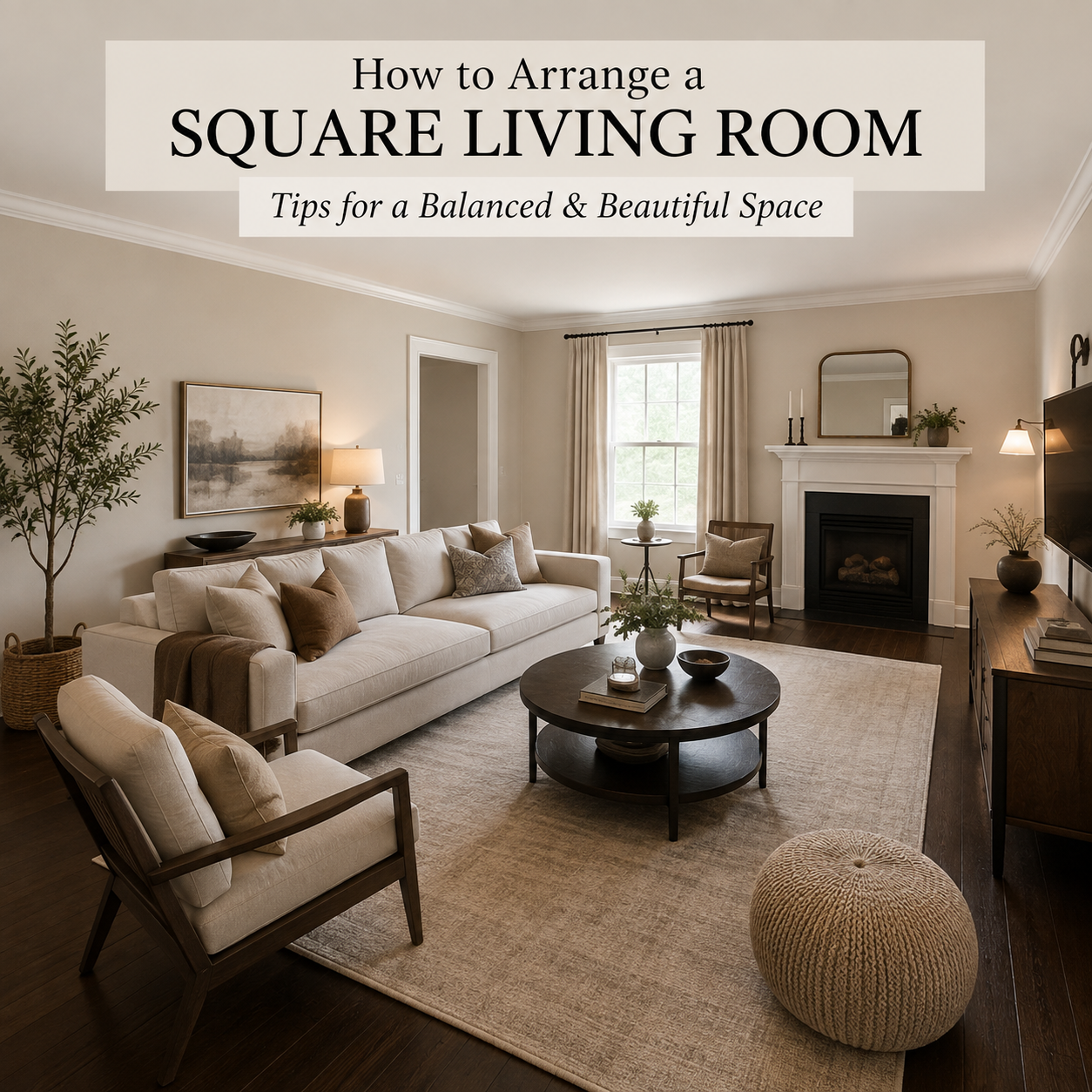
Square Living Room Layout: How to Break the Box
Disclosure: this post contains affiliate links. If you buy something through one, I may earn a small commission at no extra cost to you.
I lived in an apartment with a perfectly square living room every wall the same length, a doorway centered on one side, a window centered on the opposite one. I centered the TV on the far wall, centered the sofa across from it, and put a chair on each side like bookends.
It looked correct in the way a hotel conference room looks correct. And it felt about as warm as one.
Narrow rooms and one-wall rooms fail for obvious reasons you can see the problem the moment you walk in. A square room fails quietly. Nothing is objectively wrong with it. It just sits there, symmetrical and inert, and you can't always say why it feels flat.
Why square rooms feel static
A rectangular room has a long axis. Your eye reads direction this way is longer, so furniture naturally organizes along it. A square room has no long axis. Every wall is equal, every corner is interchangeable, and there's no built-in hierarchy telling you or your furniture where to go.
Centered, symmetrical arrangements which is what most people default to in a square room, because it feels like the "correct" response to equal walls make this worse, not better. Perfect symmetry has its place, but used as a default it reads as static and a little formal, exactly the read I got from my conference-room living room.
The fix in almost every version below is the same idea: introduce something the room doesn't have on its own. Direction, asymmetry, or a shape that isn't a rectangle.
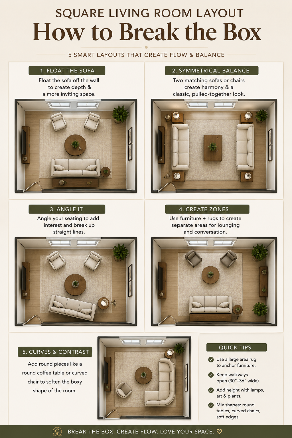
Layout 1: Float and offset
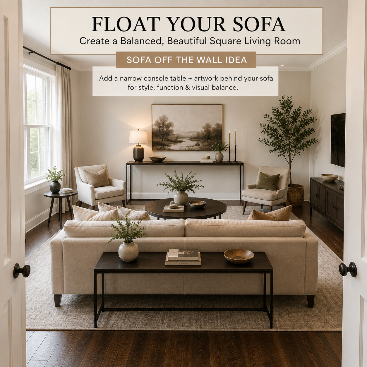
Pull the sofa off the wall entirely, and instead of centering it, position it slightly off-center relative to the room.
Behind it: a console table and some art, using the sofa back as a room divider rather than a wall-hugger.
In front: coffee table and chairs, arranged as their own grouping rather than mirroring the sofa's placement.
Why it works: off-center placement is what breaks the symmetry a square room otherwise enforces on you by default. A floated, asymmetric sofa gives the room the directional pull it doesn't have naturally.
This only works if the room has the depth for it you need walking clearance on both sides of the floated sofa, same clearances as any floated arrangement → How to Arrange a Living Room With One Usable Wall. Under about 14 feet square, this gets tight.
Layout 2: Diagonal or corner-anchored
Place the sofa across a corner at 45 degrees, or use an L-shaped sectional wrapping two adjacent walls instead of one straight run.
Why it works: a diagonal line is the strongest way to introduce direction into a room that has none. It also frees up the most floor space of any layout here, since a corner sectional uses two walls at once rather than eating into the center.
Where it goes wrong: a diagonal sofa with everything else arranged in straight lines around it looks like an accident rather than a decision. Commit to the angle let the rug, the coffee table, or a chair pick up the same diagonal, so it reads as one idea rather than one crooked piece of furniture.
Layout 3: Two facing sofas or loveseats
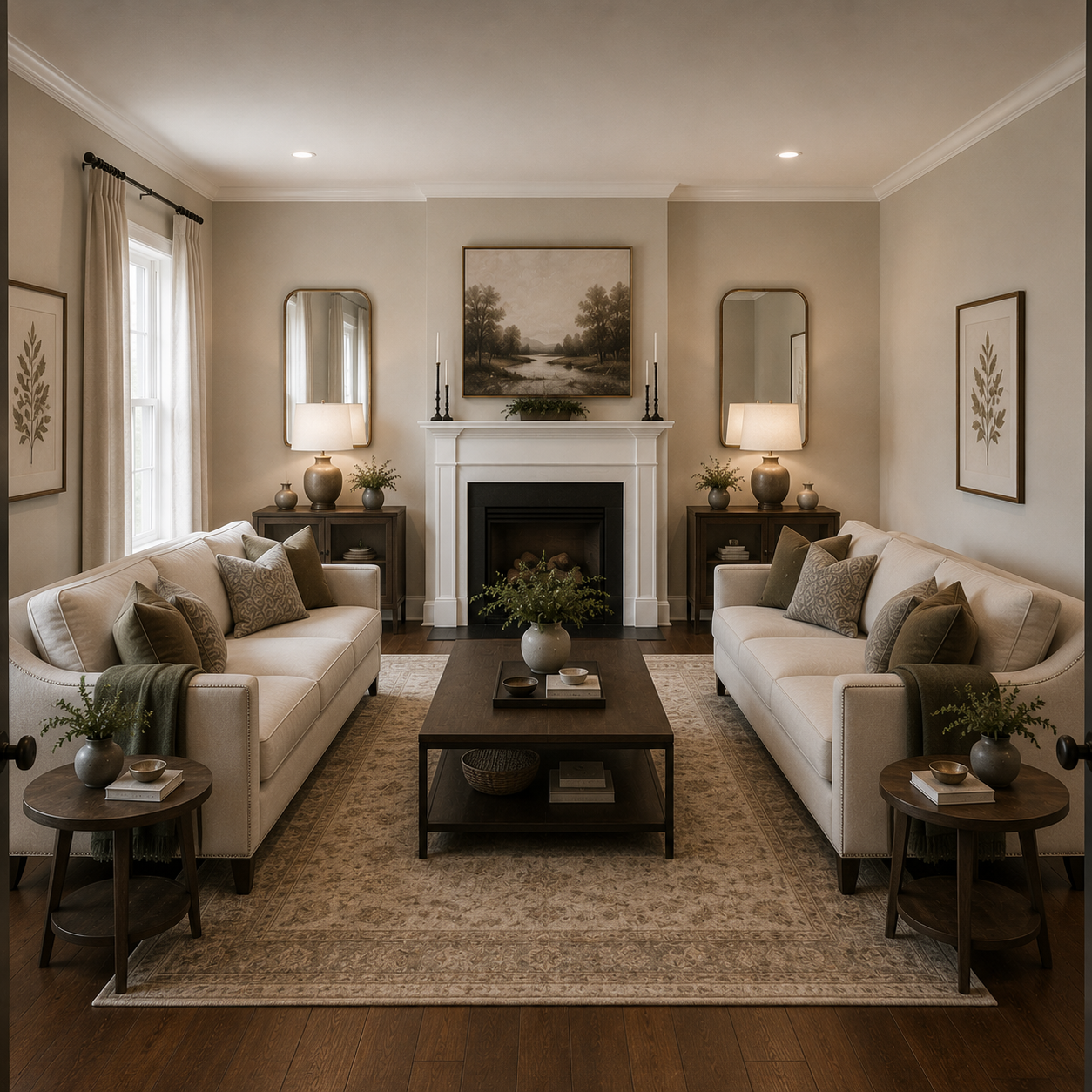
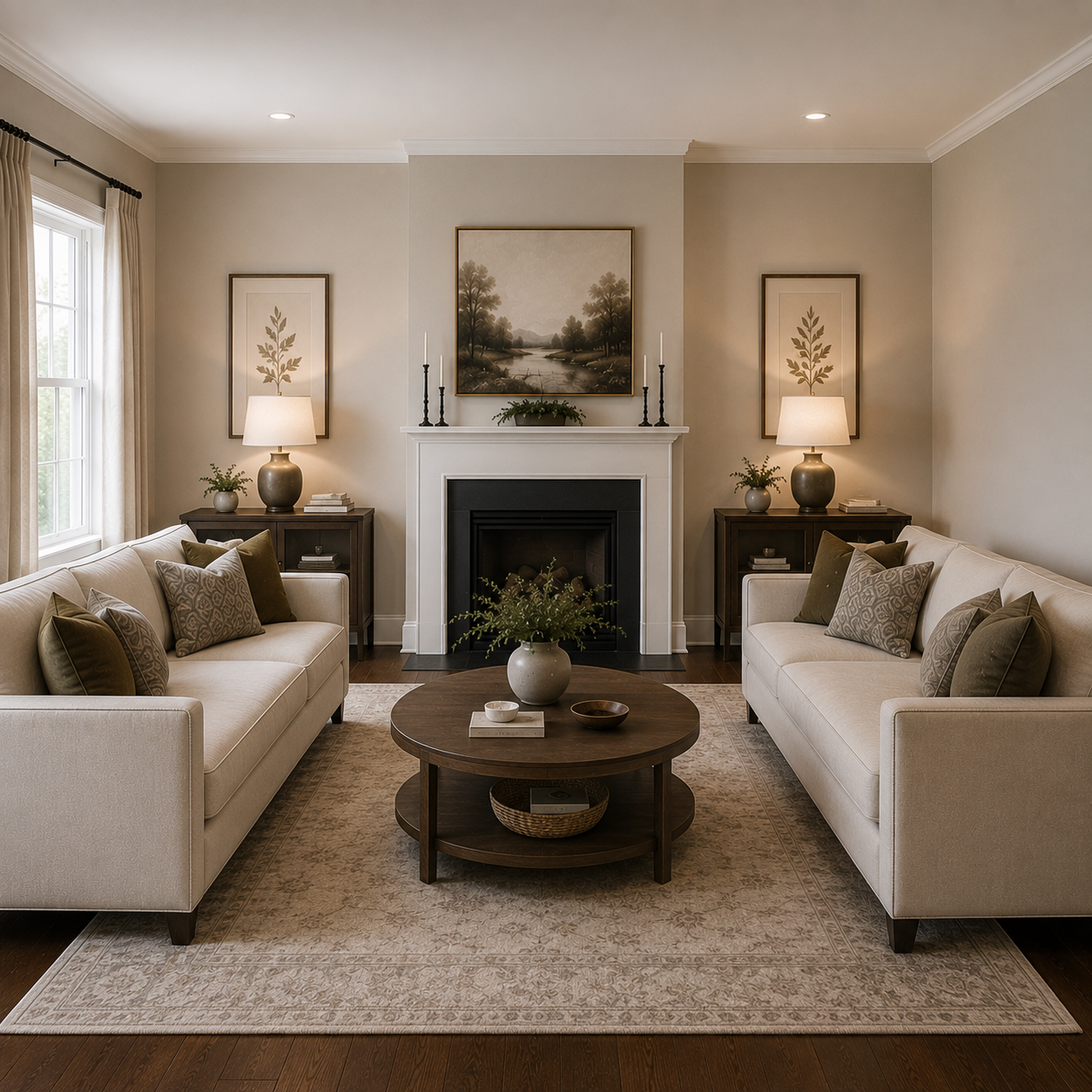
Mirror the room deliberately instead of fighting the symmetry: a sofa on one side, a matching or complementary sofa directly opposite, coffee table between them.
Why it works: this is symmetry used on purpose rather than by default, and the difference matters. An accidentally symmetrical room (TV centered, sofa centered, chair on each side, because that's what fit) reads as static. A deliberately symmetrical one two facing seats, matched proportions, a clear center reads as calm and formal in a way that can genuinely suit a square room's proportions.
The tell that separates the two: deliberate symmetry commits fully. Everything mirrors lamps, art, even the plants. Half-symmetry, where the seating matches but the rest of the room doesn't, is what produces the flat, hotel-lobby feeling.
This is a strong option in a larger square room where a single sofa-and-chairs grouping would leave the middle two-thirds of the floor empty.
Layout 4: Zone it like an open-plan space
Treat a large square room the way you'd treat an open-plan area → How to Arrange a Living Room With One Usable Wall — divide it into two or three distinct purposes rather than one large seating arrangement adrift in the middle.
Main seating in roughly two-thirds of the square. A reading corner, a desk, or a small bar cart area in the remaining third, defined by a rug change or a change in furniture orientation.
Why it works: two smaller, purposeful zones each have their own internal logic, even when the overall room doesn't. It also solves the "too much empty middle" problem that shows up in larger square rooms almost as often as the "everything against the walls" problem does in small ones.
Layout 5: Corner sectional plus a floating chair
A sectional tucked into one corner, defining the main lounge zone and leaving the rest of the square open and flexible. Add one chair, floated and angled elsewhere in the room, rather than a second matching piece.
Why it works: the sectional handles seating capacity efficiently using minimal floor area, and the single floating chair does the job Layout 1 does with the whole sofa it breaks the room's default symmetry without committing to a full diagonal or offset arrangement.
This is a good option if you want most of the benefit of "float and offset" without giving up as much central floor space.
What to get right regardless of layout
Skip the square rug
A square rug in a square room doubles down on the room's own shape instead of correcting it. Use a rectangular rug to introduce direction, or a round one to contrast the room's straight lines. Either reads better than matching the room's geometry.
[[INT: Sizing rules are otherwise the same as any room → Rug Sizing: The One Guide You Actually Need]] — front legs of the seating on the rug, minimum.
Bring in round shapes deliberately
A square room is built entirely from straight lines and right angles. A round coffee table, a round mirror, an arched lamp, a curved chair any one of these interrupts the room's geometry in a way rectangular furniture can't, and it also softens the traffic paths, since people naturally move more easily around curves than corners.
Give it a real focal point
Square rooms without a natural feature no fireplace, no standout window are the ones most likely to default to "furniture facing the TV, evenly, from every side," which is the flattest possible response.
Pick one deliberate focal point → Living Room Focal Point: Why Your Room Feels Unfinished and build the asymmetry or the zoning around it, rather than letting the TV win by default because it's the only thing in the room with an obvious front and back.
Counter the corners
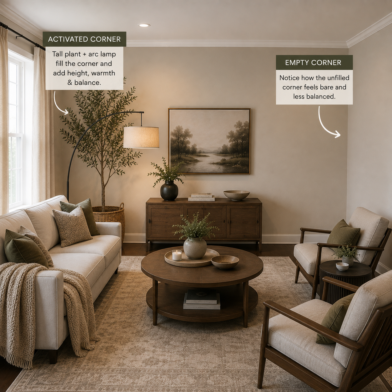
Four equal corners is part of what makes a square room feel static there's no natural place for the eye to rest. A plant, a floor lamp, or an angled chair in at least one corner gives the room a secondary point of interest and breaks the four-way symmetry.
Watch the ceiling light
A single central ceiling fixture in a square room reinforces the room's centeredness in exactly the way you're trying to avoid with the furniture. Layer the lighting instead → 10 Common Home Decor Problems a floor lamp and a table lamp off-center will do more for the room's shape than the furniture layout alone.
What to avoid
Four-way symmetry. Sofa on one wall, TV on the opposite, identical chairs on the remaining two. This is the default almost everyone reaches for in a square room and it's the flattest possible outcome it's what I did, and it's what made the room feel like a waiting area.
A square rug. Covered above, and worth repeating because it's the single most common mistake in square rooms specifically.
Centering everything. Center the TV, center the sofa, center the rug, center the light fixture and the room has no direction anywhere. Pick one thing to center, at most, and let everything else respond to it rather than to the room's own geometry.
Cramming in too much seating to fill the floor. A square room can feel like it needs "filling," and the result is often more furniture than the room actually needs for conversation to work. Two comfortable, well-placed pieces beat four mediocre ones → How to Arrange a Living Room With One Usable Wall here just as much as anywhere else.
Test it before you commit
Tape out whichever layout you're considering, walk it, sit where the furniture will be, and photograph it from the doorway → Rug Sizing: The One Guide You Actually Need. A photo flattens a square room's symmetry into a shape you can actually judge, which is hard to do standing inside it.
In my conference-room apartment, the fix was floating the sofa about 18 inches off-center, swapping the square coffee table for a round one, and moving the floor lamp into the one corner that had nothing in it. Same furniture, same room. It stopped feeling like it was waiting for a meeting to start.
The short version
A square room isn't a worse shape than a rectangular one. It just doesn't come with a direction built in, so you have to supply one through asymmetry, a diagonal, deliberate (not accidental) symmetry, or zoning.
Skip the square rug. Bring in one round shape. Give the room one real focal point instead of a TV by default. Activate at least one corner.
Any two of those will break the box. All of them and the room stops reading as square at all.
Affiliate Disclosure
Some links in this post are affiliate links. If you buy something through one, GlamNestStudio may earn a small commission it doesn't cost you anything extra. I only link to things I'd recommend to a friend, and I've used or genuinely researched everything mentioned here. It's what keeps the guides on this site free.
Before you go
More on rooms that fight back one usable wall, narrow rooms, two doorways across the guides on GlamNestStudio.