You're Hanging Your Art Too High. Almost Everyone Is.
Disclosure: this post contains affiliate links. If you buy something through one, I may earn a small commission at no extra cost to you.
In my first studio I hung everything at eye level. Which sounds correct, and is the advice you hear most often, and is wrong.
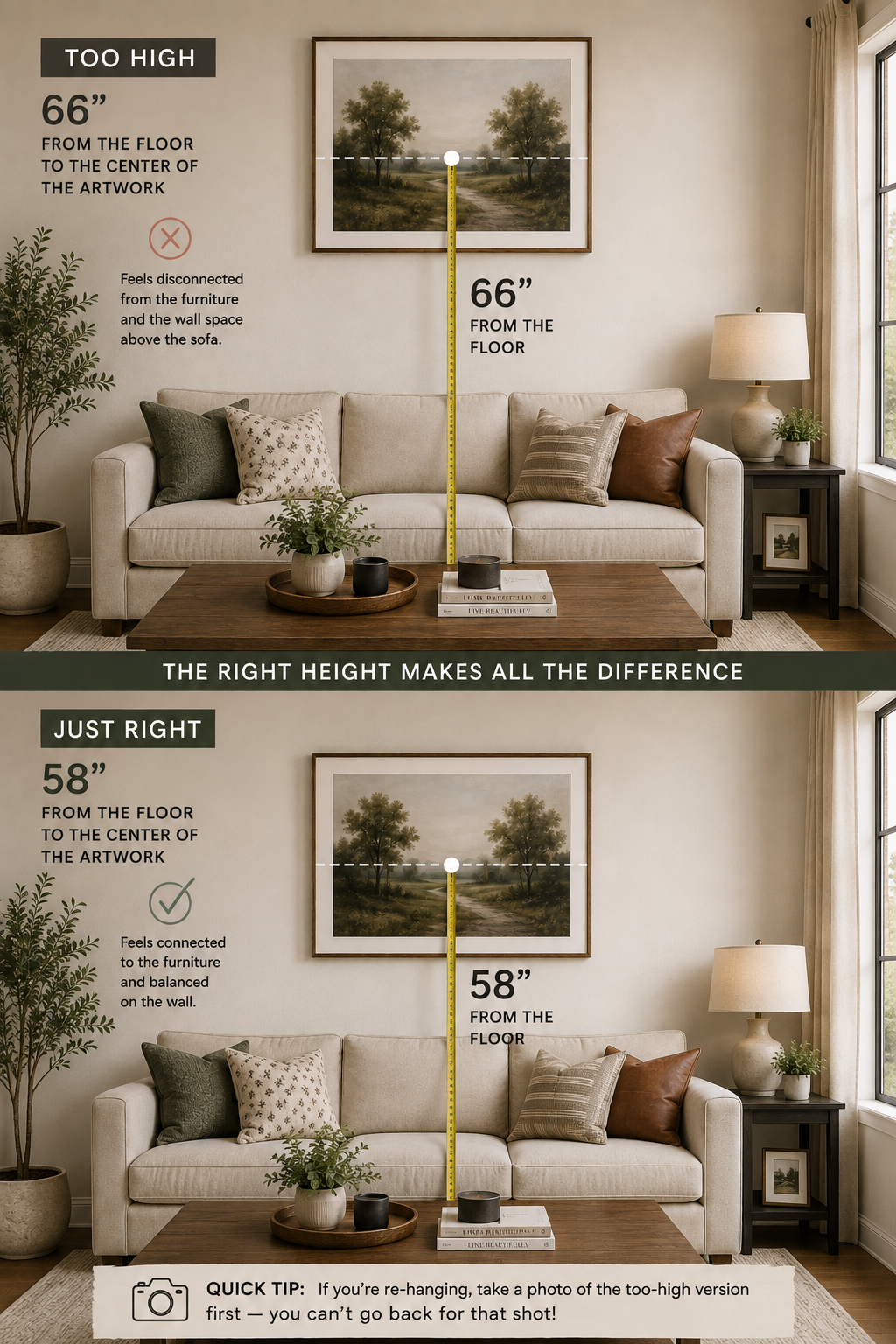
Eye level while standing is roughly 64 to 66 inches for most people. So every piece I owned sat several inches higher than it should have, and the whole apartment had a slightly floating quality art drifting up toward the ceiling, furniture stranded below it, a band of empty wall between them that I couldn't explain.
I lowered one large piece by about nine inches after reading the actual number. The change was so obvious that I spent the next evening moving everything else.
The number
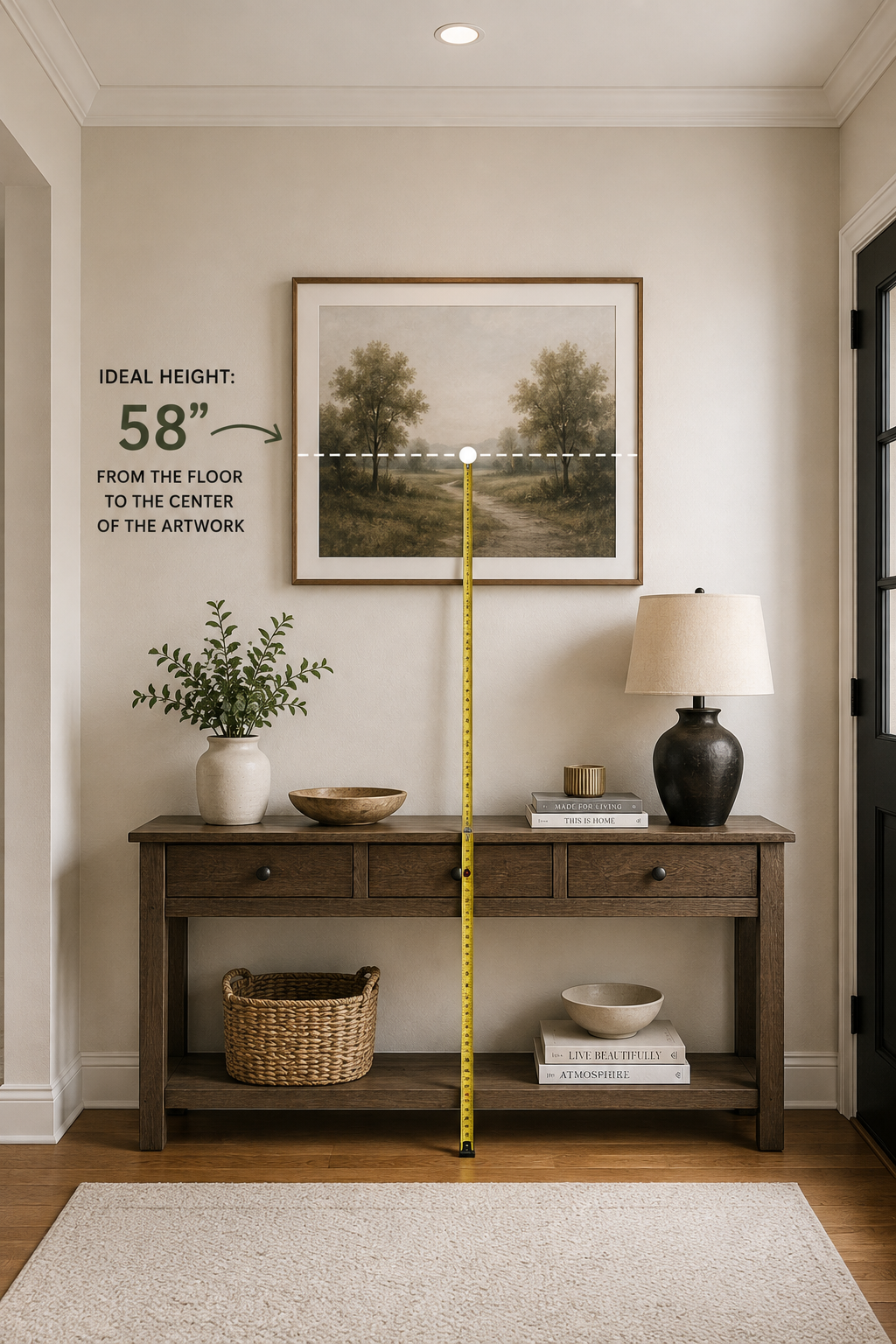
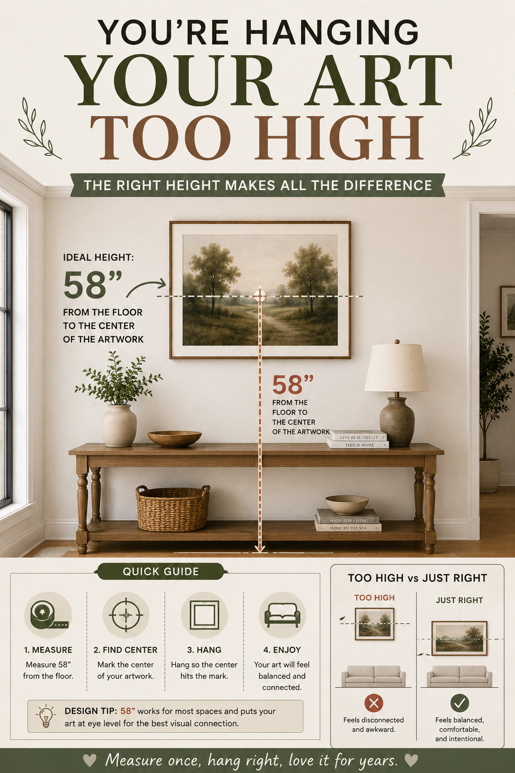
57 to 60 inches from the floor to the center of the artwork. 58 is a safe default.
This is the standard galleries and museums use, and it exists because it's the average eye level of a standing adult accounting for how people actually look at art which is with the head slightly tilted down, from a few feet back.
It's lower than instinct suggests, and that's exactly why almost everybody gets it wrong. Holding a frame against a wall at arm's length puts it at your standing eye height, which is already too high before you've measured anything.
The math for a single piece:
Nail height = 58 + (½ the frame's height) − (hardware drop)Hardware drop is the distance from the top of the frame down to where the taut wire peaks. Measure it, don't guess it varies enormously between frames.
When 58 inches is wrong
Rules have conditions. Here are the ones that matter.
Above furniture. The measurement changes to a relationship: the bottom of the frame should sit 6 to 8 inches above the sofa back, console, or headboard. Closer than 6 and it looks crowded; more than 10 and the art disconnects from the furniture and floats.
For most sofas this lands you close to 58 inches anyway. When the two rules conflict, the furniture relationship wins art above a sofa is read in relation to the sofa, not the floor.
Very high ceilings. Above roughly 10 feet, 58 inches can look low and stranded. Raise it somewhat, but far less than you'd think go up a few inches, not a foot. Or hang a taller arrangement rather than moving a single piece up.
Rooms where people are mostly sitting. Dining rooms, reading corners. Drop it an inch or two.
Stairwells. Follow the stair line, measuring 58 inches from each tread rather than from the floor.
Over a bed. Same 6-to-8-inch rule above the headboard, and keep the piece narrower than the bed.
Size, which matters more than height
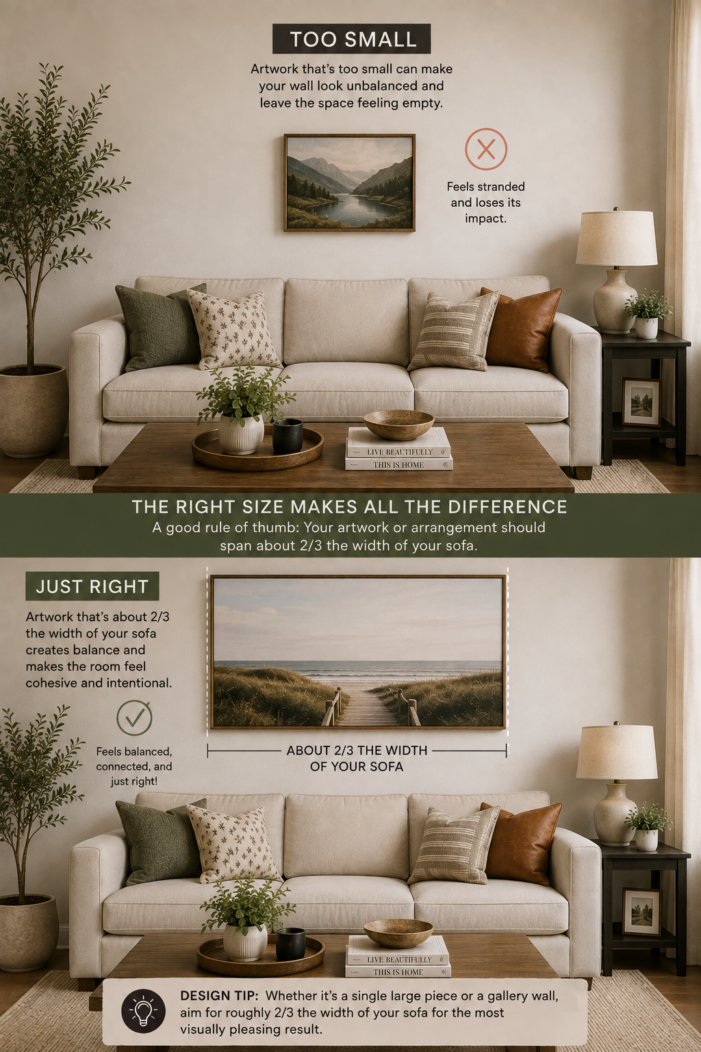
A correctly hung piece that's too small still looks wrong, and this is the more common failure.
Above furniture: the art should be two-thirds to three-quarters the width of what's below it. A 36-inch piece above an 84-inch sofa is stranded no matter how perfectly you measure the height.
On an open wall: the piece or group should fill roughly 60% of the usable wall width, with clear margins on either side.
When in doubt, larger. I've never seen a room where the art was too big. I see rooms where it's too small every week.
If a big piece isn't in the budget, group smaller ones so they act as one large one the planning method for that is here → How to Plan a Gallery Wall Before You Put a Single Nail In.
Mats, and why they're worth it
A mat is the border of card between the artwork and the frame. It does two things: it gives the image breathing room, and it makes a small piece occupy a larger footprint.
Width: 2 to 3 inches for small and medium pieces. For a genuinely dramatic effect, go much wider a 5-inch mat around a small print looks expensive in a way that's difficult to explain and immediately obvious.
Weighting: traditionally the bottom margin is slightly wider than the other three, by about half an inch. This corrects for an optical illusion where an even mat appears bottom-light. Most ready-made mats are even, and it's fine but if you're cutting custom, the weighted version looks better.
Color: off-white or cream for almost everything. Bright white can look clinical against warm walls, and colored mats date badly and fight the artwork.
The cheap upgrade: an inexpensive print, a generous mat, and a simple frame will consistently outperform an expensive print in a frame with no mat. If you're building a wall on a budget, pre-cut mats are where the money goes furthest.
Spacing, for anything hung in a group
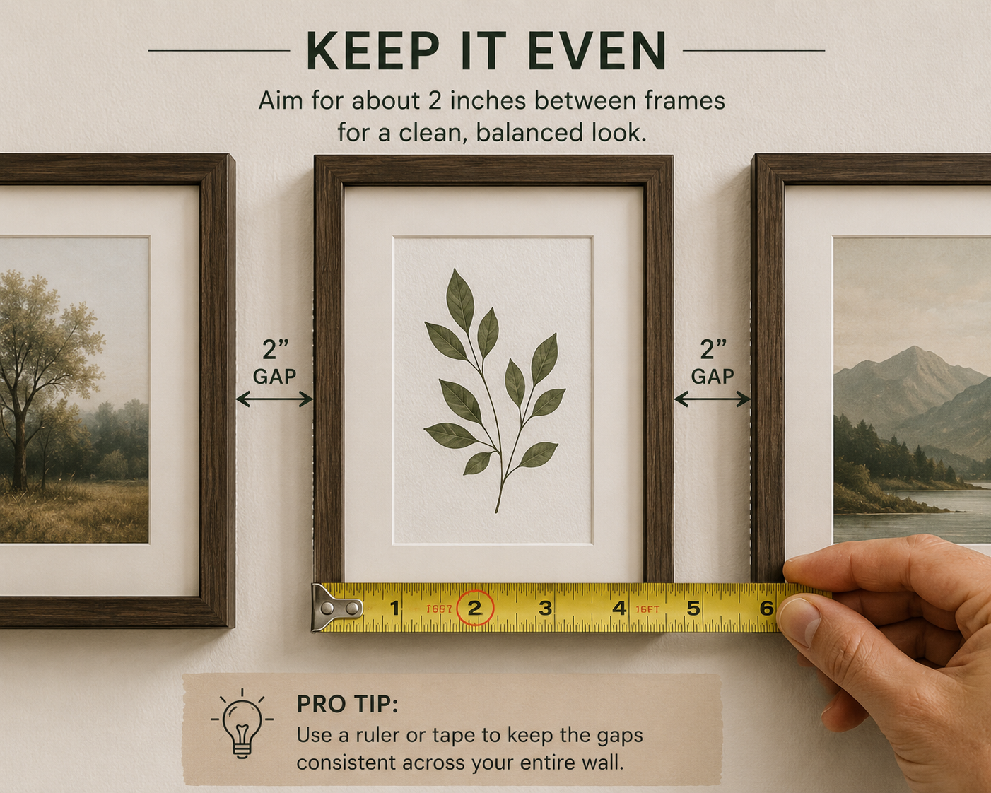
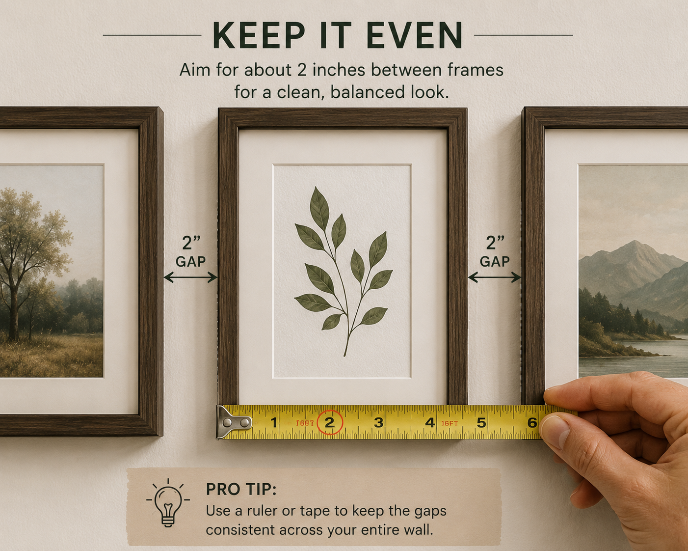
2 to 3 inches between frames. Consistent throughout.
Closer than 2 inches and the group reads as clutter. Wider than 4 and the pieces stop belonging to each other and become separate items that happen to share a wall.
The same gap in both directions. Uneven horizontal and vertical spacing is one of those things nobody consciously notices and everybody feels.
One alignment somewhere. Even in a loose arrangement, some edges should line up a shared top line, a shared vertical. That's the difference between deliberate and scattered.
Frames
Simple beats ornate for almost everything, unless the artwork is genuinely traditional.
Match one property across the set, not all of them. All the same color, or all the same width, or all wood. One shared trait reads as coordinated; matching everything reads as a boxed set.
Frame color: black is graphic and confident, natural wood is warm and forgiving, white disappears into pale walls which is either what you want or exactly what you don't. Match the wood tone to something already in the room, the way you'd match any other wood in a space → Does Furniture Have to Match?.
Glass: standard glass is fine indoors. Non-glare is worth it opposite a window. Acrylic is lighter and safer above a bed or in a kid's room, and it scratches easily.
The measurements, in one place
- Center of artwork: 57–60 inches from the floor (use 58)
- Above furniture: bottom edge 6–8 inches above the furniture back
- Art width: two-thirds to three-quarters of the furniture below it
- Mat width: 2–3 inches, or 4–5 for effect
- Frame spacing: 2–3 inches, consistent
- Group width: about two-thirds of the wall or furniture beneath
Why this is worth twenty minutes
Hanging height is one of those things that costs nothing to get right and can't be fixed by spending more money. An expensive print at 66 inches looks worse than a cheap one at 58.
It's the same category as hanging curtains high and wide → How to Hang Curtains So Your Ceilings Look Taller or buying a rug big enough → Rug Sizing: The One Guide You Actually Need — a proportion decision that quietly determines whether a room reads as considered or slightly off, and one that most people never think to check.
Go measure one thing on your wall right now. If the center is above 62 inches, that's your evening.
Affiliate Disclosure
Some links in this post are affiliate links. If you buy something through one, GlamNestStudio may earn a small commission it doesn't cost you anything extra. I only link to things I'd recommend to a friend, and I've used or genuinely researched everything mentioned here. It's what keeps the guides on this site free.
Before you go
More of the measurements that quietly decide how a room reads curtains, rugs, layout across the guides on GlamNestStudio.